Styling
Styling on the app editor can be managed at the component and app-level.
Component level
Styling can be defined at the component-level. CSS settings can be turned to global level.
Component-level CSS has priority over the global level.
Pre-set
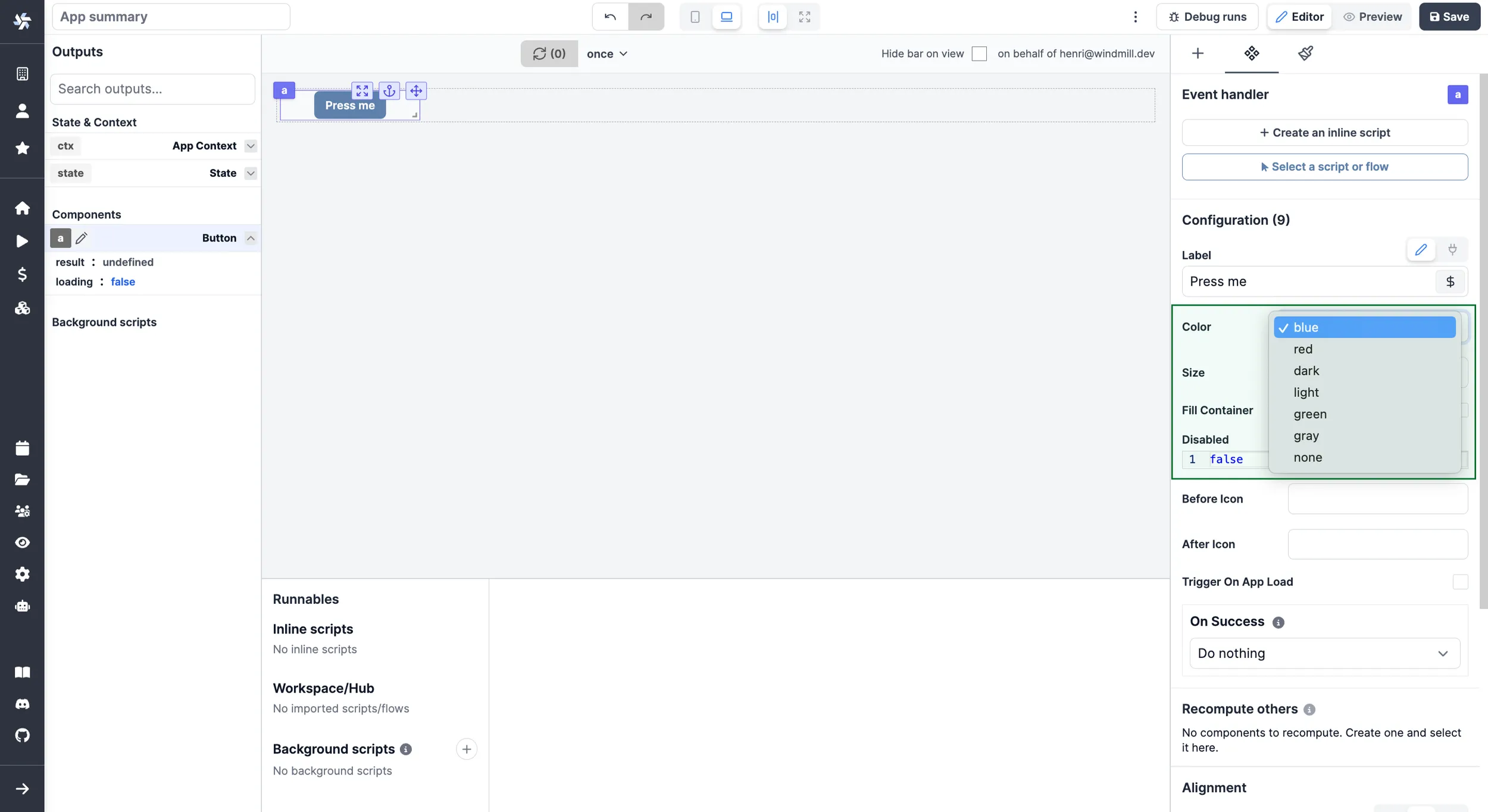
Some components have pre-set options for styling. They can be configured from the Components settings tab in the Configuration section.

Styling Menu
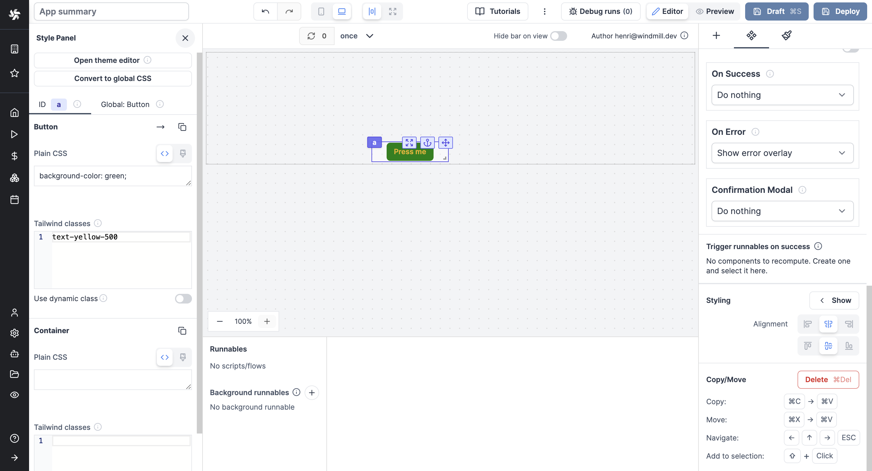
Components come with a styling menu. From there, pick styles either from CSS or Tailwind classes.

Elements like: background color (incl. shadow, opacity), border (incl. style, radius), typography (incl. font size, family, weight, spacing) etc. can all be configured for each component.
Please note that these different style classes can be combined.
From there, your CSS can be converted to a global level.
Dynamic Styling
From the Styling Menu, enable "Use dynamic class" to apply styling through an eval and therefore connect it to other components or to runnables (scripts, flows).
Global Styling
For complex apps, you may not want to repeat the styling configuration on each component.
CSS Editor
The Global CSS Editor is designed to give styling and theming across your entire app. This functionality offers a centralized location for defining, managing, and applying CSS rules. It's useful for ensuring consistent styling and for creating reusable themes.
The Global CSS Editor is a feature exclusive to Cloud plans and Self-Hosted Enterprise Edition. However, users on the Community Edition can still access and experiment with this tool directly in the editor for evaluation purposes, although these changes will not be reflected in the app preview.
Configure manually and replicate pre-set styling
Styling on a component level can be replicated to all the components of the same class from the Rich Editor.
Just click on Convert to global CSS.
Full Height
All components can be set "Desktop full height" and/or "Mobile full height".
When set to full height, a component (in its respective view type, desktop or mobile) components will have their height go down until the end of the parent container (if no, canvas).